Saturday, December 24

Painting in the Snow!

Steve and I have been in our home state of Wisconsin for the last couple of days, enjoying the Christmas season with family and friends. We checked up on the local weather before leaving Texas, and there hadn't been any snow on the forecast. In fact, it really looked like it would be a "brown Christmas". I REALLY hoped for at least a little bit of snow... and it turns out, my wish came true sooner than I thought it would! When I woke up on Thursday morning and looked out the window, there it was: a fresh, beautiful dusting of white fluffy stuff covering the trees and fields of my in-laws' surrounding country land. I got outside as soon as I could! Now, I've never painted out in the snow. There was one early-morning painting session in Switzerland that had me a little bit uncomfortable (I think it was about 45 degrees outside), but this time it was 32 and cloudy. I bundled up as best as a Wisconsinite-turned-Texan sissy knows how, and headed outside. I chose a small lone red pine for my setting, with the snowy trail nearby coming towards the viewer in the composition. The clouds made everything a dull chroma, but I tried to pull out as much color as I could see. Also, I followed the recommendations from more experienced plain air painters, who said to use Permalba white or some other white that is a bit more runny, as the paint gets stiffer when it's out in the cold.

My dog, Bella, enjoyed running around in circles and eating snow during my entire painting session (what a joy for her to be back in the country!). I lasted for about an hour before losing feeling in my fingers and toes (even though I wore gloves the whole time). It was still quite exhilarating and I had a lot of fun with it. I hope that next time, though, I'll have some sunshine to bring out more of winter's beautiful palette. So, praying for another snow storm! I'm just getting started!

Tuesday, December 13

Painting and Drawing from Life, Part II

Once again, it's been WAY too long in between posts! I'm not really sure what happened; November just flew by. I find that I am becoming more and more protective of my studio time -- it really is precious. And, with Christmas less than two weeks away, I am scrambling to get as many hours of painting time in before my husband and I make the drive to Wisconsin to spend the holidays with family. I don't think I'll be able to go nine days straight without painting, so I'll bring my pochade box along just in case the overload of food and fellowship gets to be too much for this hermit. :-)

Now, as promised, I'd like to talk a little bit more about the aesthetic side of working from life.

Excitement and focus of the artist
Some go sky-diving for the adrenaline rush; others ride roller coasters, race cars, snowboard or water ski. Personally, I get the most wonderful rush when painting from life! Whether I am outside in the open air -- or in my studio working from a live model -- there is a pronounced difference in my overall mood when I'm engaging with the real, living, breathing thing rather than working from photos or props. And let's face it, places like this (below) are enough to excite anyone, whether they're painting or not!


What does this have to do with aesthetics? Well, the more excited you are about your subject, the more focus and energy you'll be willing to invest in it, and therefore, you'll start to produce some of your best work. Having been to the Portrait Society of America's annual conference several times now, I can tell you, after having my portfolio critiqued, that the most experienced and successful artists know in an instant whether or not something was painted from life or from photos. Not only do they know for technical reasons (the photographer used flash, the whites are washed out, or the subject has a big toothy grin, etc.), but they can tell because there is something stale and stiff about the image. Working from life brings all of the artist's enthusiasm to the forefront and makes for a more lively, energized painting. This leads me into my next point...                  

Speed and decision-making
When we first start out practicing from life, there is usually some fear and trepidation over the time crunch. Perhaps you are painting en plein air and the lighting will pass in just a moment, or your model can only sit for a couple of hours before she's gone forever, moving to Spain or something (yes, this did happen to me!). That time crunch can be used to your advantage! I do not promote "panic-painting;" rather, I would encourage you to take that wasted time looking at the clock and use it to zero in on the most important elements of your painting. Before you even lay down a mark, you should know (a) what your focal point is, (b) where your lightest lights and darkest darks are, and (c) what your hardest and softest edges will be. Those decisions can be made in an instant if you are willing to think carefully about your intentions from the very beginning. We should have a specific goal for each and every painting we start, rather than mindlessly slashing away at our canvases and then getting angry when we run out of time, with little to show for it! Some of my best life studies were done in less than three hours, such as this one of Salvador (below). My goal was to do an accurate portrait by starting with the core shadow line and working out from there (this was during a Judith Carducci workshop last January). Because I kept my goals simple and my expectations realistic, it ended up working quite well.

"Salvador II" - 10x8 - oil on canvas board

During the decision-making process, the artist also has more control over how they use their brushwork to make a statement. Photos naturally lend themselves to being slavishly copied, but when working from life, you are much more likely to squint down. Squinting is key, as it helps you to simplify the scene before you and break it down to its most basic shapes, values, and edges.

Essence, Energy, and Empathy
Finally, there is something crucial that can only be captured fully when working from life: the essence of a person, place or thing. Some artists are so experienced that they can create posthumous portraits from photos and still capture that person's essence (Michael Shane Neal is a great example), but only because they have put in many hours of practice before a live model. I find that many of my life studies say more about the model's personality than paintings done from photos. I am also acutely aware of the model's physical and emotional presence while I'm working, making me empathize with them even more. I ask the question, "How can I make this portrait special? What is the model's story, as told by artist Anna Rose Bain?" As artists, it is our privilege to convey a person or place based on our own unique experience. Let's really make that experience shine by working from life to the best of our aesthetic and technical abilities!

Saturday, November 12

Life Painting + Photography + Photoshop...The Technical Side of it All

For the past year and a half, in my spare time (which I have very little of!) I have been slowly chipping away at a project that I am passionate about because I think it will help a lot of people. I am working on a "Photoshop Handbook for Traditional Artists". This project will cover a lot of the basics of photo-editing, whether it be for reference photos or photos of artwork. But I am also going to discuss why I use both photo references AND life studies in my work. It is a fine line to walk, as I believe in working from life as MUCH as possible, but... have chosen to write a book on how to edit reference photos!  My hope is that with a good understanding of both, we can become more excellent and well-rounded artists, without compromising our standards.

That being said, I am going to touch on some of what will be covered in the book, and share in detail my own personal reasons for choosing to work from life. I will also compare these points to how photographic reference can either help or compromise the integrity of an artwork.

Today I will discuss the technical reasons for working from life, and in my next blog post, I'll touch on the aesthetics.

Technical reasons for painting from life:

Anatomy
Anatomy can be learned from textbooks and copied from photos, but an artist can't really grasp the 3-dimensionality of the human form until he or she has had the opportunity to work from a live (ideally nude) model, and not just during art school, but rather, on a continual basis. The advantage to practicing from life is that you can walk 360 degrees around the model to see where and how the form connects, overlaps, and turns toward or away from the light. Being able to observe the model's movements and see from all sides is invaluable for gaining further skill and understanding.

Values
Most of us know from experience that photography causes details to be lost, both in the light areas and the darks. The reason for this is that most cameras can only meter one extreme or the other, causing the lights to be over-exposed and/or the darks to be underexposed. When working from life, the artist has the advantage of being able to see into both the lights and the darks for their actual values. There are often way more details in the lights and shadows than a snapshot can capture. Of course, it is up to us to make the aesthetic choice of whether or not to include or leave out those details (classical technique discourages too much detail or thick paint in the shadows), but at least with life painting, we have that choice!

Colors
As much as we can enhance our photos later, photography often causes certain colors to be lost, especially bright reds or burgundies, or subtle colors in the sky. Below is an example of a painting I did on location, next to the photo I took of the spot. I may have slightly exaggerated the colors and the curve of the trail for the sake of aesthetics, but still, there was definitely more color to be found by painting from life than what the photo would indicate!


Perspective
As objects come forward in space, they appear larger... as they go back in space, they appear smaller. Photography usually exaggerates this fact, to a fault (unless you are standing a ways back from the subject and using a zoom lens). I paint portraits and figures from life whenever I can, because too often, if I am relying solely on photos, a hand or a foot will appear too large.

Below is one of my photo references for the painting, "Music of the Spheres." If you look at it carefully, you can see that the model's left hand appears substantially larger than her right. I had to make sure I corrected this in my painting, as errors like these are always much more obvious in paintings than they are in the photos!


Now, here are some technical reasons for supplementing my life studies with photography and Photoshop:

Props or settings that the studio or location doesn't offer.
Cropping / Composition
I can't always afford to buy new props for every painting. But I have a limitless imagination (and a sketchbook on hand to jot down ideas!), so usually, my lack of props can't stop me from coming up with a great idea. My best example of this is again "Music of the Spheres." You are seeing something I have never shared before: a "before" shot (photo references of my studio set-up with the model) and an "after" shot (the finished painting as I envisioned it). I wanted a spherical composition and a peaceful yet mysterious kind of setting. Thanks to Photoshop, I was able to work out my composition before starting the painting. I made the globe much larger and moved it around to where I wanted it, I changed the curtains to make them all satin, added the oriental rug, window and night sky, and moved the lanterns around to better serve the spherical composition. I also changed the model's hand to look more elegant holding the violin, which required using a different photo reference than the original. Oh, and I added flowers to her hair. I'm sure I'm forgetting something, but the point is, with a clear vision and proper knowledge of the tools, one can make their vision come to life!


Dramatic color or value changes
There are times when I want to change a shirt color or make the painting more dramatic by pushing the values. Photos and tools in Photoshop can help me experiment with these things before committing to the change in the painting.

Capturing a pose that cannot be held for a long time
Of course, this is invaluable when painting moving figures, such as dancers or athletes, and very young children who can't sit still. Or, if you enjoy conveying candid moments, photo references are perfect for those as well. With commissioned portraits, the client does not usually have time to sit for extended periods, OR the portrait is supposed to be a surprise gift. In this case, we artists are often forced to work from the client's photos. Having a good understanding of what to look for in reference photos and a solid background in working from life can help make a commissioned painting turn out without looking flat or obviously copied from a photo.

More to come on aesthetics... one of my favorite topics for discussion!

Tuesday, November 8

Figurative Painting, Ballet, and... Photoshop

Thanks to a client who is interested in ballet, I have several new paintings of classical ballerinas in the works! This is especially exciting for me, since I have been wanting to expand my figurative portfolio and study the human form more carefully. Recently, I was humbled when another artist pointed out that one of my pieces had some anatomical errors. I realized that the human figure is truly the most challenging, yet exciting, thing to paint, and that I need to study it diligently in order to avoid such errors in future paintings. If I am going to do it justice, I must know how each body part moves, connects, and relates to the rest of the whole.

I began some "research" a couple of weeks ago when my sister and I went to see a ballet, and I realized I hadn't been to one since college. Back then, I don't think I had the appreciation for the human body that I have now. It is incredible how many ways the body can twist and turn and move in space, and it is also incredible to see what kinds of things the body is actually capable of! I was blown away by the grace and beauty these dancers were able to convey while doing moves that required a great deal of physical strength, agility, flexibility, and endurance.

Then, by a wonderful twist of fate, my weekly painting group lined up the perfect model to pose in a formal tutu and pointe shoes! She held a tough standing pose for us, and I was able to begin two paintings from it, both of which have great promise. The first is a full-length, 3/4-view composition, and the second is from the back and closer-up, detailing the model's beautiful shoulders and arms. The first painting is still in the works, but I just finished the second one, which you see below:

"Ballerina with Venetian Mask" - 18x12 - oil on linen
I should probably mention something about the mask... she wasn't originally holding anything when I began this painting from life. When I took the painting home after the session, I was pretty happy with it, but I felt like it needed something more. So I dug through a bunch of my photos from Europe, and happened to find this:


As you can see, I circled the mask I ended up using in the painting. It took a couple of tries in Photoshop to find one that would be perfect as far as lighting and positioning of the "face." Which reminds me... I am still working on an instructional book on Photoshop for visual artists. I can teach you this technique. Photoshop really comes in handy for situations just like this! I got the best of both worlds: a quality experience with a live model (gaining more accurate values, colors, anatomy and excitement about the pose), AND a chance to add some aesthetic changes, thanks to my enormous catalog of photo references and some help from Photoshop.

In my next post, I will blog about painting from life, and why it's so important for preventing the kinds of mistakes I made in my [aforementioned] piece. :-) 

Saturday, October 22

A Trip out to California

Last week, Steve and I went on a five-day trip to Napa, Yosemite, and San Francisco (and everything in between!). Our original excuse to go was that I had a painting accepted into the OPA Western Regional Exhibition in Calistoga (Napa Valley), so we were going to the opening reception. But that ended up being a very small part of the trip. Having never been to California before, I was in complete awe of the diversity in the landscape and climate. I knew the landscape would be beautiful, but it was more than that... it was a breathtaking display of God's creation which offered unlimited opportunities for painting!

We did it right as soon as we arrived by renting a red Camero convertible and driving down Hwy 1 from San Francisco to Monterey and Carmel. That afternoon, I had the wonderful opportunity to set up to paint at Point Lobos State Park. It was so overwhelmingly beautiful, and I realized I still have much more to learn and explore in my journey as an artist. The waves crashing up against the rocks looked different with every single pulse, and it seemed a nearly impossible task to try and capture the movement of the water. But I tried, and had a great time doing it! Life couldn't get any better than this! When I experience moments like these, where my love for nature and art become united, I feel like I can let all the cares of the world crash against the rocks like the waves, while I stand on the rocks up above, free from it all. I can simply enjoy those moments where the ocean breeze hits my face and the only sounds that reach my ears are those of the waves and the birds overhead. Wow.


Where was Steve during this time? He out and about, climbing on the rocks and taking pictures of me while I painted. He got some really great shots!


Above: the finished painting: "Late Afternoon, Point Lobos" - 12"x9". I decided not to touch it up at all when I got home, because I really enjoyed the freshness and immediacy of this one.

Below: here we are in Yosemite. It was a cloudy (and later RAINY) day, but we enjoyed the beauty nonetheless. And I painted by the waterfalls until I got rained out.


Then there was Napa Valley, where we stayed for four of the five days. We toured several of the wineries and had some wine tastings (that's just what you DO in Napa!), but I also did some painting. And, I discovered a gem of a gallery in downtown Napa, called Quent Cordair Fine Art. They feature only "Romantic Realism," so a lot of figurative painting and sculpture. Steve and I lingered there for quite some time.


This was the only painting I had time to attempt in the vineyards (below) -- "Four Rows, Napa Valley" - 12"x9". You can see that the colors are different in the photo. The light was changing very quickly in the valley as in neared sunset, so by the time I stopped, everything had turned orange and pink from the setting sun.


Our adventures took us to San Francisco, where we saw the Golden Gate Bridge and Alcatraz shrouded by fog. We explored Fisherman's Wharf, took a look at the city from Coit Tower, and strolled through Chinatown (my favorite!). It was a wonderful trip and a good source for fresh inspiration. Where will my art take me next, I wonder?

Wednesday, October 5

The Challenges of Self Portraits (from a mirror, or course!)

American Artist magazine is currently running a cover competition featuring self portraits, so that gave me some incentive to try my hand at, once again, the ever-intimidating self portrait done completely from a mirror.

Some things I learned from the experience this time around:

  • You have to cope with the model moving all the time. You'd think that since I look at myself in the mirror everyday, I'd have my features memorized. But this time it felt like I had to learn them all over again, in this specific lighting, under these specific circumstances. The lighting changes everything!
  • I asked myself the question: "Do I want to idealize myself or paint me the way I look, in this moment?" True to my classical-realist tendencies, I answered with both. The idealization was unintentional, as it is most of the time when I do a portrait. I have a real empathy for my subjects, especially this one! I also included some of the not so perfect things that make me the way I do... like the dark circles under the eyes, the big chin, and the fact that my mouth is always open when I'm concentrating on a painting!
  • You can still squint at yourself as a subject, unless you're working on the eyes. :-)
  • You can only look at one eye at a time! So, I had quite the challenge making sure my eyes in the painting weren't focused in two different directions!
  • Each self portrait should be different in some way from the last. I wanted this one to include at least one hand (mission accomplished, in natural window light, with the addition of my easel and canvas inside the composition.

Self Portrait by the Window - 15" x 14" - oil on linen

I also realized (and this was completely unplanned) that in my self-portrait and the portrait I'm working on of my husband, we are wearing the same color shirts. Weird. I'll post pictures of that one soon.

Meanwhile, here is a picture from this morning's 2 1/2-hour painting excursion at the Dallas Arboretum. It was absolutely gorgeous out today, and I hope that while the beautiful fall weather lasts, I can make this a weekly thing. There are thousands of pumpkins out there right now, as well as azaleas, roses, and chysanthemums. It's just beautiful!

I may tweak this a little more in my studio, but here is my rendition of the Poetry Garden.


"The Poetry Garden" - plein air painting, in progress

Saturday, October 1

New Plein Air Sketches

I have been doing more plein air painting, now that the weather is finally cooling down. Here are a few little studies, the first three of which are from the nature preserve that is within walking distance of my house. Because the rocky stream curves and bends so often, there are countless potential paintings waiting to be created just in this one small area.

I went out with my painting students on a couple different occasions and created these sketches.

8" x 6" study - 1.25 hrs

7" x 9" study - 1.25 hrs

12" x 9"study - 3 hours


This last one was painted at Lake Lavon in Wylie, Texas. It was about 95 degrees, with mid-day lighting, so all in all, VERY uninspiring. However, I decided to give it a shot. At least I had fun!

Thursday, September 29

The Finishing Touch: When a Painting Finds a Home

As promised in an earlier newsletter, I thought I'd share a couple pictures of paintings in their owners' homes. This is what truly finishes a work of art... when it finds a home, the picture is complete! Commissioned portraits, especially, are often designed with a specific wall or space in mind. It's very gratifying to see the finished painting in its frame, hanging in the space that it was meant for.

If you own one of my paintings and would like to share a snapshot of it in the room where it's hanging, please send me a picture! I would absolutely love to see the art in its home and share it here on my blog! Please send pictures to: annarosebain@gmail.com, and thanks in advance! :-)

The first picture features a 30" x 24" painting called, "The Young Explorer." The owner (the mother of the 18-month-old little girl) decided to hang it in her music room, and I think it looks fabulous there!


The second image is from another client's dining room, which she painted and re-decorated just for the portrait of her son. I think the finished painting makes a wonderful statement and is a beautiful centerpiece to the room.


It is the perfect time of year to commission a portrait. If you are interested, please visit my website at http://www.artworkbyannarose.com/commission.html, or email me at annarosebain@gmail.com.

Saturday, September 24

New Painting: "A Venetian Spectator"

Today I finally finished one of my paintings from this summer's trip to Italy. I enjoyed working on this one from start to finish, and found myself continually imagining up stories about this old woman's life, and what she might have to say if I were to sit down and have a conversation with her. Her expression could read any number of ways, from sour and grumpy (i.e., "Those damned tourists!") to thoughtful and lonely or simply enjoying the fresh air. Either way, I purposefully juxtaposed the old woman with a very cheerful scene at her window: brightly blooming flower pots, topped off with a rainbow-colored pinwheel. Of course, flowers, green shutters and pinwheels are familiar sights in Venice and other Italian cities, but I felt that this image had something special about it that was worth capturing in a painting.


"A Venetian Spectator" - 30"x24" - oil on linen

Originally, the old woman was looking out from a very boring window. I decided to take her and put her in the scene that I created in the painting. Here is one of the original shots (a slightly different pose in this one but it gives you an idea of the original setting):


 I looked all over for the perfect reference photos (Steve had taken at least a thousand pictures of windows!). Here are a few of the images I considered, but none of them ended up working out.


I did at last find an image of a window that I could use. Thanks to Photoshop, I was able to piece my reference materials together, making sure that the lighting matched. I was able to place the pinwheel and flowers exactly where I wanted them. I am very happy with how this painting turned out and look forward to sharing more of my works in progress soon. :-)

Friday, September 16

A Studio Filled with Potential!

Taking a look around my studio today, I counted twelve works in progress, or paintings that I've started within the past two months or so, and have yet to finish. Three of them were started just this week, and two of those were started yesterday! I'm not going to share pictures of every single unfinished painting; some have more potential than others. Some will be finished very soon because I'm excited about them; others may never see completion but will instead get sanded off and painted over.

As a 20-something, my life is in a stage of constant change. During this decade, there are so many things that happen: we graduate college, get married, buy a house, have kids, change jobs once or more, and essentially leave all of our childhood familiarities for the new and different. If I look back at the past three years since leaving my home state and moving to Texas, it's quite remarkable to see how much my artwork has progressed. Just look at some of my past blog posts -- you'll see the difference, too!

What's my point in telling you this? Well, each painting is an opportunity to learn something new, to experiment or try something different. The goal is to take my artwork to the next level and make each painting better than the last. As long as I keep this goal in the back of my mind, I can't fail. Some paintings might turn out better than others, but at least I'll have painted with intention. We think that painting is supposed to be relaxing... but that is the difference between a hobbyist and a true painter! When I "check out" during a painting, that's when I start to fail. Instead, my mind has to be utterly focused on the task at hand, without distraction. How many of us spend our time picking away at our work, or as some describe it, "licking the canvas?" How many of us actually try (and I say try because with the exception of a very few, this is impossible to perfect...) to make every single brush stroke count? As painters, we should be absolutely exhausted at the end of the day!

Well, that's what happened to me yesterday. I began two new paintings, employing some of the methods I learned at my latest workshop with Clayton Beck. I decided to go with the flow on these, and allow my style to change somewhat if it serves the painting better.

The first is a huge canvas (54" x 36") of a full-length girl, seated on a wooden chest in front of a bookshelf. The shelf is filled with old classics, art books, and various objects, including a stem of orchids, a brass pitcher, and a bust of Michelangelo's "David." The girl is holding a note and appears deep in thought. The painting is still untitled. I'm leaving her expression and pose up to interpretation, but am still working on  story line of my own. Anyway... it took me literally all afternoon to block this in. I only used white, terra rosa, and ultramarine blue for the block-in, and limited my values, especially on the figure. In the next painting session, I hope to begin developing the values more, while incorporating accurate color temperature. The light source is very warm, which is somewhat different from the usual daylight bulbs that I work with. I believe the warm lighting appropriately creates a more intimate atmosphere for this setting.

Here she is: the first image is the scene as it's set up in my studio. The second is my painting on the easel from the actual vantage point that I decided on (I'm doing this thing from life). I had to sketch the image on with charcoal before starting any of the painting. It was just too large to try eye-balling! Click the image to see larger:


I began a second painting yesterday, some time in the evening after my husband got off of work. I have been badgering him for months now about modeling for me. We've been married for three years and he's never modeled for a portrait! Finally, last night, he was willing to sit for at least the start of one. My idea with this portrait was to bring out his wonderful quality of being a good problem-solver... and that will actually be the title of the painting: "The Problem Solver." He'll be holding a rubik's cube and looking out directly at the viewer. That's just his personality: direct, bold, strong. And since it would take me forever to solve a rubik's cube, I have to brag on my husband just a little - he can solve it in about two minutes!

Since the model lives with me (ha!), I am doing this portrait completely from life. I was only able work on it for about 40 minutes, but here is what I accomplished during that time (the dimensions are 24" x 24"):


More progress pictures to come. I'm very excited about all my projects, even if a dozen seems like an overwhelming number! I love what I do, and feel privileged every day to come into my studio and paint. I hope those of you reading this are also inspired to do what you love, and do it to the best of your ability. :-)

Friday, September 9

Preparing a Linen Canvas: How To

I've been getting a lot of e-mails lately asking me how I prepare a linen canvas, and also why I prefer it over cotton canvas. So, from now on I hope to simply refer these requests to this blog post. Hopefully this helps! If you are glueing linen to panel, that is a different thing. For our purposes today, I am referring to stretching, sizing, and priming a linen canvas on stretcher bars, not panel.

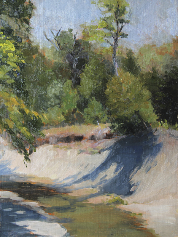
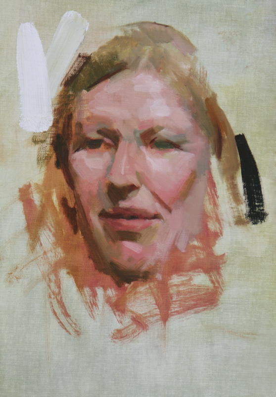
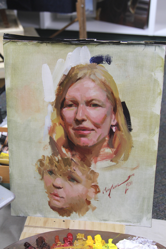
My reasons for using linen: linen is very different from canvas, not only in its texture and weave, but also in the way it is prepared and how it feels to paint on. Linen is much smoother, especially if prepared properly with a size such as rabbit skin glue or PVA glue, and an oil-based gesso rather than acrylic. The oil primer really makes for a smooth working surface, whereas acrylic gesso tends to "eat up" your oil paint during the first several working layers, causing the paint to lose its luster. This can be very frustrating. Although linen is generally much more expensive than canvas, I don't think I could ever go back to canvas. Once you've tried it, you'll realize too that there's no going back!

PREPARING A LINEN CANVAS FOR OIL PAINTING – STEP BY STEP
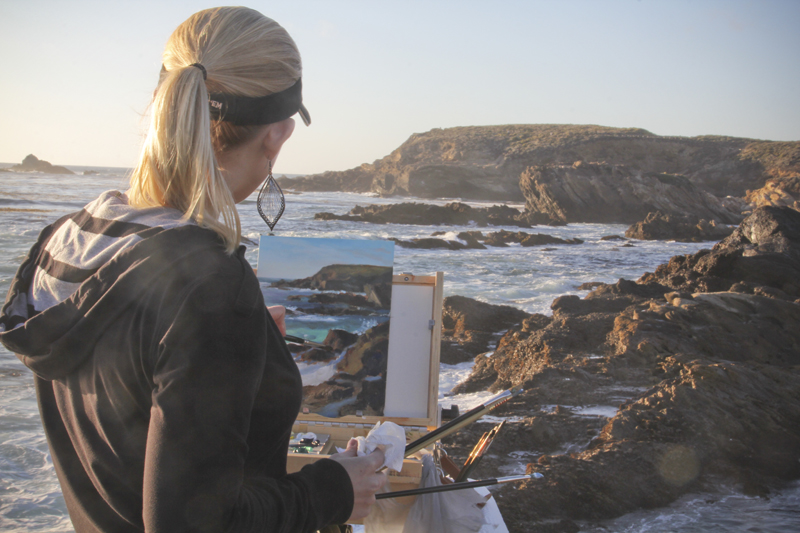
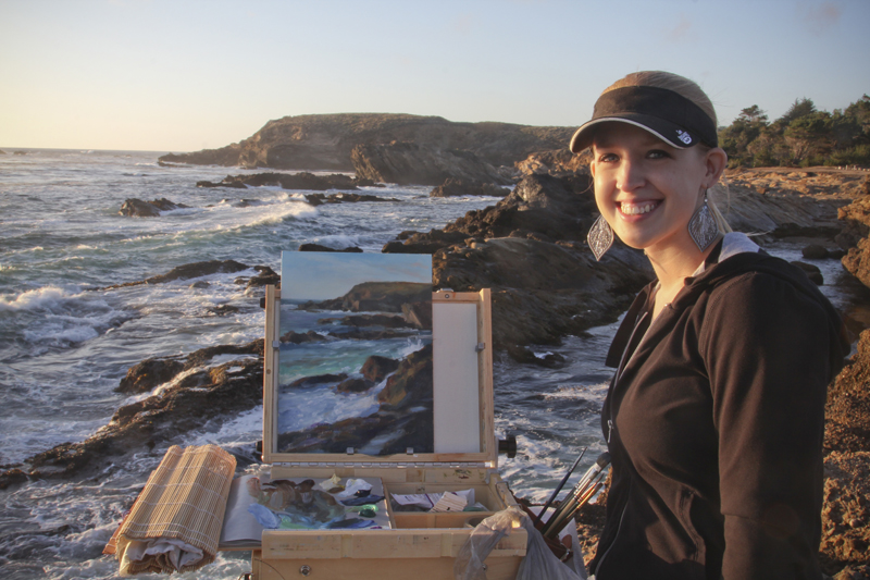
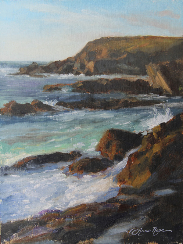
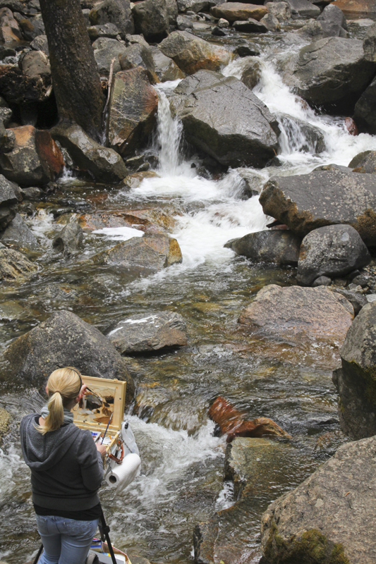
by Anna Rose Bain

SUPPLIES
  •           Linen:  Many artists purchase pre-primed linen, but I always buy mine “raw.” I find that being able to stretch and size my linen is much easier and produces better results if I do it all from scratch.  I’ve tried many different kinds, but my favorite linen to work with is Daniel Smith’s Finest Belgian Linen. Linen can be expensive, so make sure you look for an online coupon code before you buy! 
  •           Stretcher bars: You can get stretcher bars of any length through just about any art supply store or website. I often buy them from Hobby Lobby, but my favorite stretcher bars for heavier-duty, larger canvases, are from Utrecht. For any canvas bigger than 24x36, I recommend using a cross brace, attached with T-bars.
  •           Double boiler
  •           Plastic drop cloth or garbage bags
  •           Sizing: Some artists use PVA glue, but it doesn’t size the canvas as tightly as the good old traditional standard, rabbit skin glue. I know, it sounds cruel – it IS actually made from rabbit collagen… but this method has been tried and true for centuries. Not only is it is the best coating to protect a canvas from the linseed oils in paint (which would naturally destroy canvas fibers over time), but it also makes the canvas so tight that you can pluck it like a drum. You can purchase rabbit skin glue from Daniel Smith or Utrecht. It comes in powder form.
  •          Scissors
  •          Marker or charcoal pencil
  •          Stapler: I have a couple that I purchased from Hobby Lobby in the canvas/painting department. They are called “EasyTackers” and call for No. 3 or Arrow JT-21 staples.
  •           Rubber mallet
  •           Measuring Square
  •           Medium-grit sandpaper
  •           Gesso brushes (one for the rabbit skin glue, and one for priming). They should have soft bristles and be fairly large, at least 3 inches wide. For sizing, you may also use a sponge instead.
  •           Oil primer: you can purchase this from Utrecht
  •           Bucket
  •           Putty knife
  •           Oderless mineral spirits or turpentine
  •           Paper towels
  •           Plastic spoon or stirring rod for mixing


DIRECTIONS:

STRETCHING:
1) Assemble your stretcher bars, using the square to make sure they are straight.
2) Line up the stretcher bars with your linen on the floor; using a straight edge and a marker or charcoal pencil, draw a line around the stretcher bars on the linen, measuring about 1.5”-2” all the way around your stretcher bars, depending on how thick they are.
3) Cut the linen to size.
4) With the canvas still face down on the floor, staple the linen to your stretcher bars, starting with one staple in the middle of each side. Make these tight, but leave just a little slack in the middle. This is different than stretching a cotton canvas, where you stretch it as tight as you can. Continue to staple outwards towards the corners, pulling the linen relatively tight before each staple, and working all the way around rather than one side at a time.
5) Once you’ve reached the corners, fold them around neatly (if you ask me real nice I’ll make a YouTube video on the technique for folding corners!) and staple them secure.
6) When the linen has been stapled on completely, wipe off any specks or hairs on the front of the canvas before moving on.

SIZING:
1) Lay your canvas out on a plastic drop cloth, on a flat surface
2) Using a double boiler on the stove, prepare rabbit skin glue according to directions. Some directions require you to soak the RSG overnight, others don’t. I’ve tried both and found that as long as the mixture has had enough time to dissolve, whether overnight or on the stovetop, it still produces great results. Keep the burner on low, never allowing the mixture to boil. It should be heating for at least 45 minutes before it’s ready to use.
3) When rabbit skin glue is completely dissolved and nice and warm (but not HOT), take the pan off of the boiler and prepare to brush the mixture onto your prepared canvas.
4) Using a 3-inch gesso brush, apply the glue generously to your canvas, starting in the very middle and working your way out. Make sure to brush onto the sides as well. You will instantly see the canvas begin to tighten. I’ve also recently taken to using a sponge instead of a brush (you’ll want to wear rubber gloves if you do it this way!).
5) Allow canvas to dry several hours or overnight. If the canvas starts to warp because it’s been stretched too tightly, hold down opposite corners with weighted objects.
6) When dry, lightly sand canvas.
7) Apply a second coat of glue. Leftover rabbit skin glue can be re-heated, but make sure you use it up within no more than a couple of days, as it can go bad after a while.

PRIMING:
1) Lightly sand your canvas again before priming. Keep it on the plastic drop cloth.
2) Put about 4 parts oil ground and 1 part odorless mineral spirits in your mixing bucket, and stir with a mixing stick or plastic utensil (something disposable). It should be a smooth consistency but not runny.
3) Using your putty knife, apply the primer in thin, smooth strokes across the top of your canvas, working from top to bottom in one direction (as opposed to from the middle outwards, like the glue).
4) Smooth your knife strokes with your gesso brush, also moving in one direction. Make sure you prime the sides of your canvas as well.
5) Allow first coat to dry. When dry to the touch, lightly sand your canvas, wipe the surface with a slightly damp rag, and then apply a second coat of primer, this time brushing it perpendicularly to the direction you applied it before.
6) Allow this second coat to dry. If desired, a third coat may be added, but usually two coats are fine. The final coat of primer will need 10 days to dry before you start painting on it.
7) Before painting, make sure your canvas has been sanded to remove roughness and impurities.
8) Happy painting!

Tuesday, September 6

Clayton J. Beck, III Workshop at the Woodlands Art League

My head is still spinning from the overload of information I received at last week's three-day portrait and figure workshop with Clayton J. Beck, III at the Woodlands Art League. I felt extremely privileged to be there and grateful for the instruction, as it was a totally new way of thinking and painting for me.

Clayton Beck is, as my friend Michael would say, a "Schmidling," meaning that he studied under Richard Schmid once upon a time during the "golden age" of Schmid's teaching at the Palette and Chisel in Chicago. Beck now teaches there, and through his classes and workshops, he carries on the methods used by the 19th-century American artist John Singer Sargent as well as several of Sargent's contemporaries such as Anders Zorn and Joaquin Sorolla. Richard Schmid is arguably the greatest living painter, and so, to study with him or any of his former students is a HUGE privilege.


One of the many demos of Clayton's that were on display during the workshop. So inspiring!

The workshop consisted of two evening sessions with a figure model, and three full days of portrait work. Clayton's emphasis for the duration of the workshop was on values, so much so that he didn't bother to correct drawing mistakes or deal much with color (even though he's known for his ability to paint gorgeous colors!). I took a LOT of notes, but instead of writing them all down here, I'll simply share a few of the more important highlights:
  • Instead of getting wrapped up in line work to start, look at your subject in a deep squint. If you can capture the stuff you initially see in your deep squint, then you'll be all right.
  • Don't think about what things are, but rather, what they look like.
  • Never start a canvas without knowing what direction you're going in.
  • Have a realistic understanding of your own abilities and how you will react to the scene in front of you, within the time frame you are given.
  • Sometimes it's better not to have a concept. Let the model relax into the pose - yelling from eight different people to "move your arm," etc., creates tension for the model. Instead of making the model stay stiffly in the position you dictate, paint parts of the figure by opportunity. If a hand is out of place, work on something else.
  • Consistently compare areas of your painting to each other. Everything MUST relate. The harmony is in the light source, in the same way that a piece of music is written all in the same key.
  • Envision your painting from start to finish. You have control over how your painting will turn out - it is not an accident!
  • Think of everything you see as a value, an edge, or an angle, rather than a hand, hair, a mouth, etc.
  • There's no such thing as half-tone or middle value. There's only light and shadow. Look for the darkest part of the light and the lightest part of the shadow. This is where you begin your painting. Your whole world as an artist should be a division of light and shadow.
  • Work only as quickly as you can with accuracy.
  • Plan ahead; as you lay down color, know how the next brush stroke will relate to it.
  • Don't get distracted. Stick to your original idea, and finish it out.
I really enjoyed Clayton's teaching style (um... he's rather like a drill sargeant!), and I hope I get to study with him again. Here are some pictures from the last part of the workshop.

Day 3 (I was working too hard on days 1 and 2 to take many pictures, ha!): Clayton painted along side us. Here is his amazing portrait of the model so far... you can see that he established his lightest light (on our left) and darkest dark (on our right).

The model's 2-year-old son kept sitting on her lap, but he held pretty still while entertaining himself with her phone.

Clayton added an impromptu sketch of the little boy in about 20 minutes!

Here is the finished painting.

Here are my efforts from day 2 of the workshop, with our model, Pete. I was focused primarily on finding "the darkest part of the light and the lightest part of the shadow." Later I started adding in color temperature.

Day 3: My attempt at painting the model with more time spent on developing my values more gradually. The result is really a solid-looking head. I can't wait to take this method even further!

While I have a pretty solid background in classical drawing and technique (solid enough to sell my work and make a living at it, thank you very much!), I'm always excited about learning something new and adding to my painting repertoire. I've been thinking about this workshop ever since I got back from it last Friday night, and I have a feeling I'll be digesting the information for months - perhaps years! The thing that really struck me is that I had never understood how Sargent (...or Richard Schimd) painted. I always felt that their methods were completely out of reach and beyond me - that I'd never learn how to do it. I never even bothered copying a Sargent painting because I didn't know the method. Now that I've caught a glimpse of it, I'm more excited than ever to try my hand at "painting like Sargent" here at home! So now that I'm back, I've been downloading high-res images of works by Sargent, Zorn, and Sorolla from the Art Renewal Center. For those of you who are unfamiliar with the ARC, it's a fabulous resource for artists!

Well, onward... I have a lot of work to do! :-)

Friday, August 19

Skin Tones and New Colors

Whether showing my work in my studio, in a gallery, at an art festival, or--if I'm really lucky--in a national publication or competition--my portrait and figure work has consistently received more attention than my landscapes or still lives. While I'm really okay with that, it still makes me think about the quality of my work and wonder where I could improve. I'll be the first to tell you that I'm relatively new to landscape painting; the freshness of it and the required quick reaction time when on location are things one can perfect only with hours of practice. Still life, like landscape, is a genre that's been done time and again and there's nothing new under the sun. For both landscape and still life, only the very best will stand out. Portraits and figures, however, are a different kind of challenge. My conclusion as to why viewers, jurors, and collectors alike prefer my portrait work to everything else is this: (1) figurative work is just plain difficult, and (2) they can all tell where an artist's true passion lies. My absolute favorite thing to paint is skin tone. There's nothing more mysterious, luminous, or colorful.

About a year and a half ago, I was challenged by another artist to take a good look at my work and see whether or not I was really getting somewhere with my painting in the area of color. One can't really be a painter, of course, without an obsession with color... however, this person essentially told me that while my local colors seemed spot-on, there was something lacking in the area of chromatic "nuance and vibration". What did he mean by that? Well, I started looking at other artists' work and seeing things I had never noticed before -- beautiful greens, purples, reflected lights, and much more, mingled in hair and skin tones -- all a direct result of careful observation of the quality and temperature of the light. These little gems of color did not detract from the paintings or make them look unrealistic; on the contrary, images with such color nuances seemed more realistic. I'm thinking particularly of modern masters such as Dan Gerhartz and Scott Burdick, but even some of the Academic painters of the 19th century have a bold understanding of color while maintaining a tightly realistic style.

Detail of painting by Daniel Gerhartz
  
Portrait of Gabrielle Cot, by William Bouguereau.
To see a high-resolution version of this image, visit the Art Renewal Center here.

What is "local color"? According to ArtLex.com, local color is "the true color of an object or a surface as seen in typical daylight, rather than its color as seen through atmosphere or interpreted by the taste or imagination of the artist. Thus the characteristic local color of a lemon is yellow." The problem with painting everything according to its local color is that color is completely dependent on light. So the color of a thing will change based on its relationship to everything around it, including the light source, the temperature of the light (warm vs. cool), and the local colors of surrounding objects.

All this to say: I'm on an ongoing mission to explore the nature and nuances of color (as if mastering brushwork, values, and drawing weren't difficult enough!). To give you an example, here is one of my current works in progress, "Taylor's Dance" (60" x 36" - oil on linen):


I am studying the relationship of the red cloth and the model's skin, as well as the nature of the very cool light source. The areas that are in the light should be cool, but the shadow areas are warm. When there is a warm light source, the shadow areas should be cool. Additionally, there are subtleties in the skin tones that emanate blues, greens, purples and pinks depending on the anatomy (veins, arteries, muscles, etc.).


See the greens, blues and purples in the feet? There is so much beautiful color in skin! Now, I have a number of favorite "recipes" for skin tones. My go-to green is Viridian; I've also come to enjoy using Cobalt Violet because it's very subtle. Brilliant Pink is perfect for lips and cheeks, and the delicate warm tones found in fingers and toes. Lately I've also been adding some supplimental colors to my palette, including a spread of "Radiant" hues from Gamblin. I find that they are a wonderful addition for cool skin tones. I'm curious to hear from other artists what you enjoy using for skin tones. Thoughts?


There's always the problem of less-than-exciting skin tones when working from reference photos. Should the artist make up colors that aren't there? Well, no... but having a solid understanding of skin tones under different lighting conditions is key. The more you practice by working from life, the more you'll be able to "fill in the blanks" when working from photos.
Related Posts Plugin for WordPress, Blogger...