That being said, I am going to touch on some of what will be covered in the book, and share in detail my own personal reasons for choosing to work from life. I will also compare these points to how photographic reference can either help or compromise the integrity of an artwork.
Today I will discuss the technical reasons for working from life, and in my next blog post, I'll touch on the aesthetics.
Technical reasons for painting from life:
Anatomy
Anatomy can be learned from textbooks and copied from photos, but an artist can't really grasp the 3-dimensionality of the human form until he or she has had the opportunity to work from a live (ideally nude) model, and not just during art school, but rather, on a continual basis. The advantage to practicing from life is that you can walk 360 degrees around the model to see where and how the form connects, overlaps, and turns toward or away from the light. Being able to observe the model's movements and see from all sides is invaluable for gaining further skill and understanding.
Values
Most of us know from experience that photography causes details to be lost, both in the light areas and the darks. The reason for this is that most cameras can only meter one extreme or the other, causing the lights to be over-exposed and/or the darks to be underexposed. When working from life, the artist has the advantage of being able to see into both the lights and the darks for their actual values. There are often way more details in the lights and shadows than a snapshot can capture. Of course, it is up to us to make the aesthetic choice of whether or not to include or leave out those details (classical technique discourages too much detail or thick paint in the shadows), but at least with life painting, we have that choice!
Colors
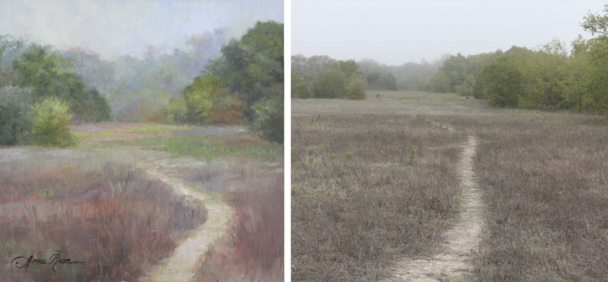
As much as we can enhance our photos later, photography often causes certain colors to be lost, especially bright reds or burgundies, or subtle colors in the sky. Below is an example of a painting I did on location, next to the photo I took of the spot. I may have slightly exaggerated the colors and the curve of the trail for the sake of aesthetics, but still, there was definitely more color to be found by painting from life than what the photo would indicate!
Perspective
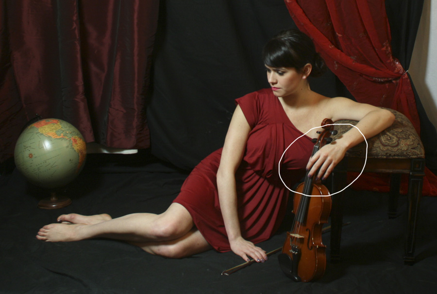
As objects come forward in space, they appear larger... as they go back in space, they appear smaller. Photography usually exaggerates this fact, to a fault (unless you are standing a ways back from the subject and using a zoom lens). I paint portraits and figures from life whenever I can, because too often, if I am relying solely on photos, a hand or a foot will appear too large.
Below is one of my photo references for the painting, "Music of the Spheres." If you look at it carefully, you can see that the model's left hand appears substantially larger than her right. I had to make sure I corrected this in my painting, as errors like these are always much more obvious in paintings than they are in the photos!
Now, here are some technical reasons for supplementing my life studies with photography and Photoshop:
Props or settings that the studio or location doesn't offer.
Cropping / Composition
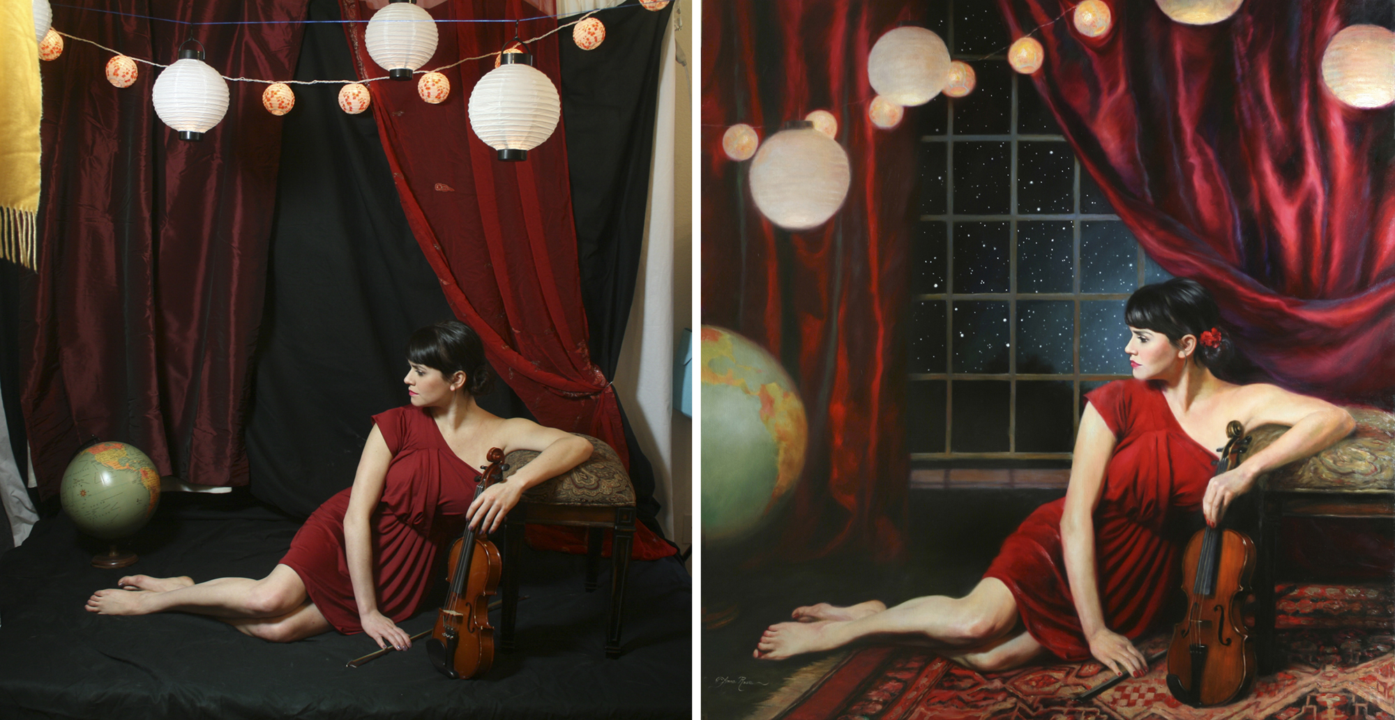
I can't always afford to buy new props for every painting. But I have a limitless imagination (and a sketchbook on hand to jot down ideas!), so usually, my lack of props can't stop me from coming up with a great idea. My best example of this is again "Music of the Spheres." You are seeing something I have never shared before: a "before" shot (photo references of my studio set-up with the model) and an "after" shot (the finished painting as I envisioned it). I wanted a spherical composition and a peaceful yet mysterious kind of setting. Thanks to Photoshop, I was able to work out my composition before starting the painting. I made the globe much larger and moved it around to where I wanted it, I changed the curtains to make them all satin, added the oriental rug, window and night sky, and moved the lanterns around to better serve the spherical composition. I also changed the model's hand to look more elegant holding the violin, which required using a different photo reference than the original. Oh, and I added flowers to her hair. I'm sure I'm forgetting something, but the point is, with a clear vision and proper knowledge of the tools, one can make their vision come to life!
Dramatic color or value changes
There are times when I want to change a shirt color or make the painting more dramatic by pushing the values. Photos and tools in Photoshop can help me experiment with these things before committing to the change in the painting.
Capturing a pose that cannot be held for a long time
Of course, this is invaluable when painting moving figures, such as dancers or athletes, and very young children who can't sit still. Or, if you enjoy conveying candid moments, photo references are perfect for those as well. With commissioned portraits, the client does not usually have time to sit for extended periods, OR the portrait is supposed to be a surprise gift. In this case, we artists are often forced to work from the client's photos. Having a good understanding of what to look for in reference photos and a solid background in working from life can help make a commissioned painting turn out without looking flat or obviously copied from a photo.
More to come on aesthetics... one of my favorite topics for discussion!


